 Add Row
  Add
Add 


Did you know that a consistent visual brand can boost your revenue by up to 33%? Whether you’re launching a new product, refreshing your logo, or simply want to stand out in a crowded digital marketplace, understanding visual branding is your fastest route to gaining customer trust and loyalty. In this guide, we’ll unlock the science and the art behind creating a visual brand that customers connect with in seconds. Learn actionable strategies, pitfalls to avoid, and real-world examples that prove why visual branding is the unsung hero behind today’s most beloved brands.
Why Visual Branding Matters: A Data-Driven Insight
A consistent visual brand increases revenue by up to 33%—stand out and see results fast!
- 90% of information transmitted to the brain is visual, and people process images 60,000 times faster than text.
- Consistent presentation of a brand across platforms increases revenue by 23%.
- Colors improve brand recognition by up to 80%.

Visual Branding’s Immediate Influence on Brand Image & Brand Identity
Visual branding directly shapes the first impression consumers form of your brand image and brand identity . When potential customers encounter your brand—whether through a social media post, a marketing strategy, or packaging—the way visual elements are presented triggers instant emotional responses. If your visual identity displays consistency, clarity, and creativity, it’s far more likely that users will recall and prefer your brand, even after a fleeting glance.
Brands with a strong visual identity project trustworthiness and professionalism. A consistent brand mark , distinctive color palette , and cohesive graphic design all reinforce what your company stands for. This not only draws in your target audience but also keeps your brand top-of-mind. Imagine the immediate recognition of the signature apple logo, or the visual punch of Coca-Cola’s red. That’s visual branding in action—making your brand instantly memorable and emotionally resonant.
How a Strong Visual Brand Builds Customer Trust in Seconds
Trust is built visually before a word is read or a conversation is had. A strong visual brand leverages iconic brand marks , harmonious color schemes , and repeated visual elements to generate credibility. When your visual branding aligns across your website, packaging, and every media post, customers see your brand as reliable and professional, which dramatically reduces skepticism and increases the likelihood of conversion.
Research confirms that people decide whether to trust a brand in less than a second. Therefore, a unified visual brand identity does more than just look good—it reassures customers that your business is consistent, legitimate, and here to stay. This kind of trust can translate directly into greater loyalty and higher lifetime value per customer.
Defining Visual Branding, Visual Identity, and Brand Identity
- Visual branding is the strategic use of visual elements such as logos, colors, typography, and imagery to represent your brand’s personality, values, and promise.
- Visual identity refers specifically to the suite of design elements—logos, color palettes, typography, and imagery—used to form a cohesive visual language for your brand.
- Brand identity is the overall impression, including visual branding , tone of voice, core values, and customer experience, that creates a lasting connection between your brand and its audience.

Understanding these differences is crucial for building a successful brand. While visual branding encompasses the broader strategy of how visual elements communicate your brand persona and story, visual identity is the toolkit that brings that strategy to life. Meanwhile, brand identity combines both visual and non-visual elements (like messaging and experience) to capture the essence of your business.
What You’ll Gain from Mastering Visual Branding
- Learn how to build a cohesive and impactful visual brand
- Understand the key components of strong visual branding
- Acquire tools and templates for a practical approach
Mastering visual branding equips you to differentiate your business and drive customer preference in a saturated market. You’ll gain clarity in shaping your brand story, selecting the right color palettes, and implementing consistent brand guidelines for all marketing materials. As a result, your brand image will become instantly recognizable, helping you attract your ideal target audience and boost your return on investment across all channels.
Understanding Visual Identity in Visual Branding
Visual Identity: Foundation of a Strong Visual Brand

Your visual identity lays the foundation for all visual communication with your audience. From a logo’s curvature to the specific hue of a brand color , these elements combine to tell your brand story at a glance. A visual identity isn’t just for aesthetics; it’s designed to work strategically to evoke specific feelings and align perceptions with your brand persona and core values .
Building a strong visual identity starts with auditing every visual element customers see—your social media post template, business cards, packaging, and even your storefront sign. When these elements are developed with intentionality and consistency, you create a powerful brand experience that can elevate a new or existing brand above the competition.
Visual Elements and Their Role in Brand Identity
Visual elements —logos, icons, color palettes, typography, and even photo styles—form the building blocks of a memorable brand identity . These elements must be curated and used deliberately to reflect the distinct personality and values of your business. For example, bold, geometric typography communicates confidence and modernity, while a muted, pastel color palette suggests calmness and reliability.
The real power of visual branding lies in repetition and reinforcement. Seeing the same brand mark and graphic elements across every marketing channel creates a consistent brand that customers recognize and trust. Creating templates for visual elements in your style guide can ensure this consistency and reduce confusion internally and externally.
How to Develop a Powerful Visual Brand
Crafting Your Brand Story for a Memorable Visual Brand
Every successful visual brand begins with a compelling brand story . This narrative is the glue that binds your visual identity and brand personality . When crafting your story, focus on the ‘why’ behind your business: your mission, core values , and unique journey. Use these pillars to inform the tone and direction for every visual decision moving forward, from your logo’s design to the imagery shared in your next social media post.
Ensure your brand story is evident in both your messaging and visual elements. For instance, if sustainability is central to your brand persona , consider earth tones and natural imagery. If innovation is your hallmark, opt for bold geometric forms and vibrant gradients. Your visual brand should always be a living reflection of the values and ambitions at the heart of your business.
Choosing a Signature Color Palette for Visual Branding

Your color palette is one of your most powerful visual branding assets. The right blend of colors can set the tone for your entire brand image , appealing to specific emotions and even influencing buying decisions. Research shows that color alone can improve brand recognition by up to 80%. When selecting a color scheme , think about your audience and industry: bold reds and electric blues work for tech and media, while soft pastels may suit wellness and lifestyle brands.
Don’t just pick favorite colors—use data, competitive analysis, and color psychology principles to inform your choices. Consider how your primary, secondary, and accent colors will be used across all marketing materials, packaging, and digital touchpoints. Codify these choices in a style guide so every designer, marketer, and stakeholder knows exactly how to leverage your visual assets for maximum consistency and impact.
Incorporating Graphic Elements for Cohesive Visual Identity
Beyond colors and logos, graphic elements such as icons, patterns, and supporting imagery add distinctiveness to your visual identity. These should be carefully chosen and consistently applied across your website, social media, presentations, and print collateral. Unique graphic elements can enhance storytelling and set your visual brand apart in saturated markets.
To reinforce a cohesive visual identity , define set rules for graphic design elements: specify which icons, illustrated motifs, or texture overlays are “on brand” and how they should be used together. This level of detail, often found in a comprehensive brand style guide, ensures every external touchpoint feels unified, building trust and preference among your target audience.
Utilizing Brand Marks Effectively in Your Visual Branding
The brand mark —whether it’s Apple’s apple or Nike’s swoosh—is a cornerstone for quick brand recognition. Effective visual branding leverages a clear and versatile brand mark that scales well, stays readable in all formats, and evokes the desired emotional response. Use your brand mark purposefully on high-visibility assets like packaging, digital icons, business cards, and every social media post.
Supplement your brand mark with well-integrated graphic elements and keep it consistent across all channels. This repeated exposure cements your brand image in the minds of customers, making it easy for them to remember your business amid the noise.
Visual Branding Strategy: Steps to Achieve a Strong Visual Impact
- Establishing clear brand guidelines
- Creating a brand style guide for consistency
- Designing graphics and layouts that resonate
Set the stage for a strong visual brand by developing robust brand guidelines. These should spell out exactly how to use logos, color palettes, typography, imagery, and graphic elements in every scenario. A comprehensive style guide is a toolkit for both internal teams and external partners, ensuring every media post, marketing strategy, and customer interaction reflects the same recognizable identity.
To maximize brand recognition , invest time in designing layouts, templates, and graphics that connect emotionally and visually with your target audience . Test these designs across different platforms—from your website to printed assets—to guarantee legibility and coherence everywhere your brand appears.
Case Studies: Brands with a Strong Visual Brand Identity
| Brand | Visual Branding Elements | Outcome |
|---|---|---|
| Apple | Minimalist logo, monochrome palette, sleek product design | Immediate global recognition, premium positioning |
| Coca-Cola | Signature red, script logo, classic bottle silhouette | Emotional nostalgia, universal recall |
| Spotify | Vivid green, simple brand mark, dynamic backgrounds | Youthful energy, instant app recognition |
| Airbnb | Soft color palette, abstract brand mark, friendly typography | Community-focused, approachable brand experience |
Brand Identity that Sparked Instant Recognition
Legendary visual brands like Nike and McDonald’s succeeded not only because of marketing spend, but because their visual identities became synonymous with their promises. Nike’s swoosh represents motion and possibility—showing how a powerful brand mark and cohesive graphic design enable even a social media post to spark recognition worldwide. McDonald’s golden arches invoke feelings of comfort and anticipation, all through simple, repeated visual elements applied across every touchpoint.
What sets these brands apart isn’t just design, but the strategic deployment of their visual branding assets. Maintaining visual consistency, evolving thoughtfully, and adapting across every format and platform ensures that brand recognition endures for generations.
The Psychology Behind Color Palettes and Brand Color in Visual Branding
Why Your Brand Color Choices Influence Perceptions

The psychology of color is a cornerstone in visual branding . Your brand color does more than catch the eye—it shapes perception, drives action, and even cultivates loyalty. Studies reveal that up to 90% of snap judgments made about products can be based on color alone. Warm tones like red and yellow evoke excitement and optimism, while cool blues and greens project trust and stability.
Selecting your color palette should always start with your target audience and the emotions you want your brand image to convey. Brands in tech and finance often lean into shades of blue to emphasize dependability, while beauty brands may choose softer pastels to signal luxury or comfort. These choices aren’t arbitrary—they’re strategic decisions designed to prime customers’ feelings about your brand, even before they recognize your name or brand mark .
How a Cohesive Color Palette Builds a Lasting Visual Brand
Consistency breeds memorability. A unified color palette stitched across your packaging, digital ads, and even your storefront delivers a seamless brand experience . This repetition strengthens associations in the customer’s mind, helping them remember and return to your visual brand again and again.
Successful brands go beyond primary colors, defining secondary hues, accent swatches, and even rules for gradients or custom textures in their style guide. With each touchpoint, your business moves closer to genuine top-of-mind status—building trust, triggering associations, and translating into real-world sales and loyalty.
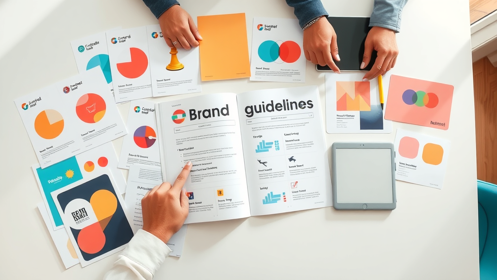
Creating and Using a Brand Style Guide for Visual Branding
- Key components to include in your brand style guide
- Role of brand guidelines in sustaining visual consistency
Every successful brand relies on a detailed brand style guide to maintain visual coherence across all channels. This guide should outline logo usage and variations, approved color palettes, proper typography scales, predefined templates for marketing materials, rules for icons and photography, and examples of what to do—and what not to do. As your brand grows and new team members join, this resource becomes indispensable for on-brand media posts, packaging design, and more.
By embedding your brand guidelines into workflows and onboarding, you prevent rogue interpretations that could dilute your brand identity. The result? Every public-facing asset, from the smallest favicon to a billboard, strengthens the core emotional connection your business seeks to cultivate with every target audience segment.
The 3-7-27 Rule of Branding: Maximizing Visual Branding Impressions
Explaining the 3-7-27 Rule and Its Relevance
The 3-7-27 rule encapsulates how quickly consumers form and cement impressions: it takes just 3 seconds for a first impression of your visual brand, 7 seconds for basic brand recognition, and 27 seconds of deeper engagement for true memorability. This principle highlights the need for clean, simple, and highly recognizable visual branding that captures attention instantly and rewards closer inspection.
If your visual branding is cluttered or inconsistent, you risk losing potential customers before they ever engage with your offer. The science is clear: those initial moments set the trajectory for trust, loyalty, and conversion.
Practical Examples: Using the Rule in Your Visual Brand Strategy
Applying the 3-7-27 rule means refining your brand mark to its simplest recognizable form—eliminating unnecessary graphics that could distract or confuse. Businesses should audit every key asset, from social media posts to email signatures, ensuring brand marks, color palette, and other visual elements reinforce your identity without friction.
For example, a social media ad should communicate your value at a glance ( 3 seconds ), reinforce recognition with your brand mark and colors when users linger ( 7 seconds ), and finally, invite users to engage more deeply with compelling content or offers ( 27 seconds ). This layered strategy maximizes each impression for impact and retention.
Graphic Design Trends Fueling Modern Visual Branding
- Minimalism and bold typography
- Cutting-edge graphic elements for 2024

In 2024, top trends in graphic design are shaping the evolution of visual branding across every industry. Minimalism reigns supreme, with flat graphics, ample white space, and sparse, impactful colors capturing attention in an age of digital overload. Businesses are also embracing bold typography—using large, expressive fonts to create personality and enhance readability on websites and mobile devices.
Other trends include sci-fi inspired gradients, animated logos, and immersive 3D illustrations. Adopting these fresh graphic elements can inject energy and modernity into your brand’s look, helping you stand apart while still feeling relevant and approachable to your target audience .
People Also Ask About Visual Branding
What is visual branding?
- Visual branding is the combination of visual elements like colors, logos, and styles that communicate a brand’s values and personality to its audience.
What is visual identity vs visual branding?
- Visual identity refers to the specific elements (like logo, color palette, typography), while visual branding is the strategic use of these elements to shape perception and recognition.
What is the 3 7 27 rule of branding?
- The 3-7-27 rule states that it takes 3 seconds for a first impression, 7 seconds for brand recognition, and 27 seconds of continued interaction for memorability.
What is the power of visual branding?
- Visual branding influences customer trust, loyalty, and buying decisions by creating an immediate and lasting impression—boosting emotional connection and brand preference.
Practical Checklist: Building an Unforgettable Visual Brand
- Audit your current visual brand assets
- Define your brand story and personality
- Select a distinctive color palette
- Design memorable brand marks and logos
- Develop a comprehensive brand style guide
- Ensure consistency across all graphic elements and platforms

Regularly use this checklist to maintain a strong, unforgettable visual brand identity. Start with deep audits: examine how each visual touchpoint performs and refine weak spots. Elaborate on your brand story in new content and refresh your color palette with seasonal or trend-sensitive updates. Regular feedback and clear guidelines mean your brand will only become more cohesive and powerful with time.
Top 10 Tips for Strong Visual Branding in 2024
- Keep your visual identity simple and impactful
- Maintain consistency in color palette and graphics
- Use unique brand marks for quicker recognition
- Regularly update your brand style guide
- Incorporate bold graphic elements to stand out
- Leverage storytelling in visual branding materials
- Test visual elements across different platforms
- Stay updated on visual branding trends
- Monitor competitor visual brands for insights
- Gather feedback and iterate your visual branding
Watch a demonstration on aligning your visual identity (colors, logo, typography) with your overall visual branding strategy for a recognizable and consistent brand presence.
Benefits of Investing in Strong Visual Branding
- Elevates customer recognition and trust
- Improves brand recall and loyalty
- Drives higher engagement across touchpoints
With strong visual branding , you create powerful first impressions, maintain audience attention longer, and build stronger emotional bonds. These benefits drive growth, higher engagement, and sustained market advantage for your business.
Common Visual Branding Mistakes to Avoid
- Ignoring the value of a cohesive graphic design
- Neglecting brand guidelines or style guides
- Underestimating the importance of brand color consistency
Don’t dilute your brand image with inconsistent designs or arbitrary colors. Avoid common missteps by establishing clear guidelines, updating them regularly, and ensuring all teams stick to the plan. Cohesive graphic elements lead to a reliable, recognizable, and successful brand.
Engage with an interactive video walk-through showing how real brands have reimagined their visual branding to transform public perception and skyrocket customer loyalty.
Expert Quotes on the Power of Visual Branding
"A brand is no longer what we tell the consumer it is—it is what consumers tell each other it is." – Scott Cook
Frequently Asked Questions on Visual Branding
- What are the essential elements of visual branding? Logos, color palettes, typography, imagery, graphic elements, and consistent guidelines make up the core visual assets.
- How often should you update your visual brand? Review your visual branding every 2-3 years—or sooner if your strategy, target audience, or design trends shift significantly.
- Do color palette changes impact brand loyalty? Yes, abrupt or frequent color changes can confuse customers and erode loyalty. Update your palette with intention, communicating changes clearly to your audience.
- What free tools can help create a visual brand? Tools like Canva, Adobe Express, and Coolors.io can help you create, test, and apply visual branding elements quickly and professionally.
Summary: Building a Strong Visual Brand for Instant Customer Love
- Visual branding is the strategic visual system behind every beloved brand.
- A cohesive visual identity is vital for instant recognition and trust.
- Consistent application builds loyalty, preference, and long-term success.

Ready to Reinvent Your Visual Branding?
- Let's have a chat, call 908-641-9211
To deepen your understanding of visual branding and its impact, consider exploring the following resources:
-
“What Is Visual Branding & Its Key Elements” : This article provides a comprehensive overview of the essential components that constitute visual branding, including logos, typography, color palettes, graphic elements, and imagery. It emphasizes how each element contributes to creating a cohesive and recognizable brand identity. ( designrush.com )
-
“Visual Branding: How to Build a Visual Brand Identity” : This resource delves into the process of developing a unique visual brand identity, offering practical tips on logo design, color selection, typography, and the use of imagery. It also highlights the importance of consistency and emotional connection in visual branding. ( mailchimp.com )
By exploring these resources, you’ll gain valuable insights into crafting a visual brand that resonates with your audience and stands out in the marketplace.


Write A Comment